JL
A semantic browser designed for navigating large Xcode codebases using a column-based interface. By organizing functions, classes, and definitions spatially, it enhances developer focus, reduces search friction, and supports intuitive symbol discovery within complex development environments.

Project
Interface design, developer tooling, and code navigation systems for large-scale Xcode environments.

My Role
UI/UX design, interaction flows, and usability testing, from concept sketch to working prototype.
Timeline
4-weeks sprint including user research, interface prototyping, and user testing with engineers.
This project was born out of real conversations with friends, software engineers who frequently struggled to get oriented when joining new teams or debugging large-scale projects in Xcode.
File-based navigation didn’t reflect how developers think in terms of symbols, logic, and relationships, not just folders.
Design Process
I followed a Design Thinking approach to guide this project, from empathy to testing, because it allowed me to stay user-centered while solving a complex, abstract problem.
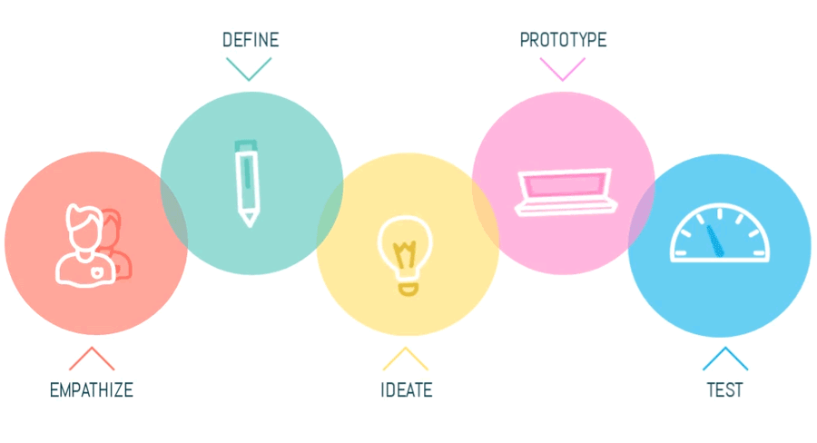
1. Empathize
I began the process by interviewing a focus group of engineers in my network.
Through casual but focused conversations, I asked about their workflows inside IDEs, specifically how they approach understanding unfamiliar codebases.

Swift Developer
iOS App Builder

Backend Engineer
API Infrastructure Architect

Game Developer
Unity Engine Coder

ML Engineer
Modular Python Specialist

Frontend Developer
UI Interaction Coder

Junior Engineer
New Code Navigator
The challenge wasn’t understanding the logic, but locating it. Most relied on memory, search tools, or scanning file trees, methods that made exploration slow and disjointed. From their insights, I distilled two key needs:
2. Define
Current file browsers group the code by location, not meaning. This forces developers to guess where logic is defined based on naming or structure. Developers think in terms of functions, types, and protocols, not files and these were their main painpoints:
Pain Points
🔺
Hard to Onboard
New developers struggle to understand codebase structure quickly.
🔺
Inefficient Symbol Search
Finding functions or classes requires guessing or memorization.
🔺
Flat File Hierarchy
File-based views don’t reflect code relationships.
🔺️
Tooling Lacks Context
IDE tools offer access, but not understanding.
🔺️
No Structural Overview
Developers can’t see how pieces of code connect.
🔺
High Cognitive Load
Constant scanning leads to fatigue and confusion.
Solutions
3. Ideate
I explored different metaphors: list views, graph diagrams, expandable trees. Ultimately, column-based navigation inspired by Finder’s “Miller columns” felt like the most elegant fit.
Generating Ideas
Column-Based Layout
Stacked columns to let users explore symbols step by step
Symbol-Based Structure
Organize content by type, like classes and functions
Smart Symbol Filtering
Let users narrow results by symbol kind and scope easily
Flexible Code Navigation
Allow free movement between symbols without a fixed path
Quick Hover Previews
Show symbol details on hover to reduce screen switching.
Visual Mapping Mode
Explore graph-based views to reveal symbol relationships visually.
User Journey Map
4. Prototype
I built a prototype to test how well this column-based layout would work in practice. I built a clickable prototype to test if column-based navigation helped developers find symbols faster. It focused on filtering, jumping between types, and previewing definitions.
Low-Fidelity Prototype
I started with wireframes to define layout, structure, and flows. Focused on column logic and symbol grouping without visual styling. These were my goals:
🎯
Test basic navigation
🎯
Map user flows
🎯
Get early feedback
I usually start prototyping with quick paper sketches, using pre-cut sheets to make the process faster. I spend less than five minutes sketching early layout ideas, just enough to get the structure and flow down without overthinking the details. Working this way helps me save time and get early feedback before moving into high-fidelity mockups.
It gives me a chance to test assumptions, see how others respond to the concept, and make changes while things are still easy to adjust. This way, I avoid putting too much time into polished designs before making sure the core idea actually works for the people I'm designing for.
High-Fidelity Prototype
Refined the layout with real data and visual details. Focused on hierarchy, filters, and previews for a realistic experience.
🎯
Simulate real use
🎯
Evaluate UI clarity
🎯
Prepare for testing
Prototype Demo
A walkthrough of the final interactive prototype, showcasing column-based navigation, symbol filtering, and contextual previews in action, designed to reflect real developer workflows.
5. Test
I conducted informal usability tests with the same group of engineers from earlier interviews. Each participant explored the prototype and completed tasks like finding a class, previewing a method, or filtering by symbol type. Here is what I tested:
🧪
Clarity of column-centered navigation
🧪
Effectiveness of symbol grouping
🧪
Ease of finding and previewing definitions
“It’s like Finder, but for code. It shows you structure, not just files.”
Xcode user testing feedback from a software engineer
Designing for developers means balancing efficiency and clarity. This project reinforced the value of semantic structure and spatial design patterns in technical workflows. I also learned how important even small friction points can be in daily tools.
🌿
Navigation felt intuitive
Users compared it to Finder, familiar, but more purposeful for code.
🌿
Symbol previews reduced friction
Hover-based previews minimized file switching and boosted focus.
🌿
Filters improved efficiency
Helped users quickly narrow down large symbol sets.
🌿
Minor confusion led to refinement
Feedback on filter placement prompted a layout adjustment.

Let’s Create with Intention
From concept to craft, I bring ideas to life. Reach out and let’s begin.
Get in Touch
JL
A semantic browser designed for navigating large Xcode codebases using a column-based interface. By organizing functions, classes, and definitions spatially, it enhances developer focus, reduces search friction, and supports intuitive symbol discovery within complex development environments.
Project
Interface design, developer tooling, and code navigation systems for large-scale Xcode environments.
My Role
UI/UX design, interaction flows, and usability testing, from concept sketch to working prototype.
Timeline
4-weeks sprint including user research, interface prototyping, and user testing with engineers.
This project was born out of real conversations with friends, software engineers who frequently struggled to get oriented when joining new teams or debugging large-scale projects in Xcode.
File-based navigation didn’t reflect how developers think in terms of symbols, logic, and relationships, not just folders.
Design Process
I followed a Design Thinking approach to guide this project, from empathy to testing, because it allowed me to stay user-centered while solving a complex, abstract problem.
1. Empathize
I began the process by interviewing a focus group of engineers in my network.
Through casual but focused conversations, I asked about their workflows inside IDEs, specifically how they approach understanding unfamiliar codebases.
Swift Developer
iOS App Builder
Backend Engineer
API Infrastructure Architect
Game Developer
Unity Engine Coder
ML Engineer
Modular Python Specialist
Frontend Developer
UI Interaction Coder
Junior Engineer
New Code Navigator
The challenge wasn’t understanding the logic, but locating it. Most relied on memory, search tools, or scanning file trees, methods that made exploration slow and disjointed. From their insights, I distilled two key needs:
2. Define
Current file browsers group the code by location, not meaning. This forces developers to guess where logic is defined based on naming or structure. Developers think in terms of functions, types, and protocols, not files and these were their main painpoints:
Pain Points
🔺
Hard to Onboard
New developers struggle to understand codebase structure quickly.
🔺
Inefficient Symbol Search
Finding functions or classes requires guessing or memorization.
🔺
Flat File Hierarchy
File-based views don’t reflect code relationships.
🔺️
Tooling Lacks Context
IDE tools offer access, but not understanding.
🔺️
No Structural Overview
Developers can’t see how pieces of code connect.
🔺
High Cognitive Load
Constant scanning leads to fatigue and confusion.
Solutions
3. Ideate
I explored different metaphors: list views, graph diagrams, expandable trees. Ultimately, column-based navigation inspired by Finder’s “Miller columns” felt like the most elegant fit.
Generating Ideas
Column-Based Layout
Stacked columns to let users explore symbols step by step
Symbol-Based Structure
Organize content by type, like classes and functions
Smart Symbol Filtering
Let users narrow results by symbol kind and scope easily
Flexible Code Navigation
Allow free movement between symbols without a fixed path
Quick Hover Previews
Show symbol details on hover to reduce screen switching.
Visual Mapping Mode
Explore graph-based views to reveal symbol relationships visually.
User Journey Map
4. Prototype
I built a prototype to test how well this column-based layout would work in practice. I built a clickable prototype to test if column-based navigation helped developers find symbols faster. It focused on filtering, jumping between types, and previewing definitions.
Low-Fidelity Prototype
I started with wireframes to define layout, structure, and flows. Focused on column logic and symbol grouping without visual styling. These were my goals:
🎯
Test basic navigation
🎯
Map user flows
🎯
Get early feedback
I usually start prototyping with quick paper sketches, using pre-cut sheets to make the process faster. I spend less than five minutes sketching early layout ideas, just enough to get the structure and flow down without overthinking the details. Working this way helps me save time and get early feedback before moving into high-fidelity mockups.
It gives me a chance to test assumptions, see how others respond to the concept, and make changes while things are still easy to adjust. This way, I avoid putting too much time into polished designs before making sure the core idea actually works for the people I'm designing for.
High-Fidelity Prototype
Refined the layout with real data and visual details. Focused on hierarchy, filters, and previews for a realistic experience.
🎯
Simulate real use
🎯
Evaluate UI clarity
🎯
Prepare for testing
Prototype Demo
A walkthrough of the final interactive prototype, showcasing column-based navigation, symbol filtering, and contextual previews in action, designed to reflect real developer workflows.
5. Test
I conducted informal usability tests with the same group of engineers from earlier interviews. Each participant explored the prototype and completed tasks like finding a class, previewing a method, or filtering by symbol type. Here is what I tested:
🧪
Clarity of column-centered navigation
🧪
Effectiveness of symbol grouping
🧪
Ease of finding and previewing definitions
“It’s like Finder, but for code. It shows you structure, not just files.”
Xcode user testing feedback from a software engineer
Designing for developers means balancing efficiency and clarity. This project reinforced the value of semantic structure and spatial design patterns in technical workflows. I also learned how important even small friction points can be in daily tools.
🌿
Navigation felt intuitive
Users compared it to Finder, familiar, but more purposeful for code.
🌿
Symbol previews reduced friction
Hover-based previews minimized file switching and boosted focus.
🌿
Filters improved efficiency
Helped users quickly narrow down large symbol sets.
🌿
Minor confusion led to refinement
Feedback on filter placement prompted a layout adjustment.
Let’s Create with Intention
From concept to craft, I bring ideas to life. Reach out and let’s begin.
Get in Touch
JL
A semantic browser designed for navigating large Xcode codebases using a column-based interface. By organizing functions, classes, and definitions spatially, it enhances developer focus, reduces search friction, and supports intuitive symbol discovery within complex development environments.
Project
Interface design, developer tooling, and code navigation systems for large-scale Xcode environments.
My Role
UI/UX design, interaction flows, and usability testing, from concept sketch to working prototype.
Timeline
4-weeks sprint including user research, interface prototyping, and user testing with engineers.
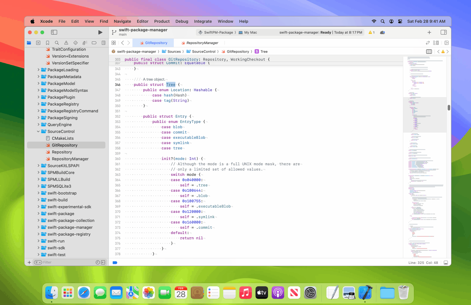
Software developers often work with large codebases composed of hundreds of files and thousands of symbols.
🗂️ Massive Codebases
Developers often work within repositories containing thousands of files and symbols.
🧭 Unfamiliar Territory
Entering a new project requires time to understand the architecture and naming conventions.
🔍 Hard-to-Find Definitions
Locating functions, classes, and protocols often involves trial and error or keyword guessing.
🛠️ Limited Tooling
File trees and search tools offer linear access but no semantic or structural guidance.
🧠 Cognitive Load
Forming a mental model of the system takes significant effort, slowing down productivity.
This project was born out of real conversations with friends, software engineers who frequently struggled to get oriented when joining new teams or debugging large-scale projects in Xcode.
File-based navigation didn’t reflect how developers think in terms of symbols, logic, and relationships, not just folders.
Despite tools like Quick Open or breadcrumbs, finding what you're looking for still involved lots of manual searching, clicking, and guesswork.
🎯
A simple way to mark important messages in real time
🎯
Design a column-based symbol browser for Xcode.
🎯
Surface structure spatially, rather than by file location
🎯
Support a faster onboarding, easier code discovery
Design Process
I followed a Design Thinking approach to guide this project, from empathy to testing, because it allowed me to stay user-centered while solving a complex, abstract problem.
1. Empathize
I began the process by interviewing a focus group of engineers in my network.
Through casual but focused conversations, I asked about their workflows inside IDEs, specifically how they approach understanding unfamiliar codebases.
Swift Developer
iOS App Builder
Backend Engineer
API Infrastructure Architect
Game Developer
Unity Engine Coder
ML Engineer
Modular Python Specialist
Frontend Developer
UI Interaction Coder
Junior Engineer
New Code Navigator
The challenge wasn’t understanding the logic, but locating it. Most relied on memory, search tools, or scanning file trees, methods that made exploration slow and disjointed. From their insights, I distilled two key needs:
🔑
Fast exploring and navigating large codebases
🔑
Design a column-based symbol browser for Xcode.
2. Define
Current file browsers group the code by location, not meaning. This forces developers to guess where logic is defined based on naming or structure. Developers think in terms of functions, types, and protocols, not files and these were their main painpoints:
Pain Points
🔺
Hard to Onboard
New developers struggle to understand codebase structure quickly.
🔺
Inefficient Symbol Search
Finding functions or classes requires guessing or memorization.
🔺
Flat File Hierarchy
File-based views don’t reflect code relationships.
🔺️
Tooling Lacks Context
IDE tools offer access, but not understanding.
🔺️
No Structural Overview
Developers can’t see how pieces of code connect.
🔺
High Cognitive Load
Constant scanning leads to fatigue and confusion.
Solutions
Engineers need tools that match how they think, focused on meaning, not just location, and built for natural, flexible navigation.
💡 Column-Based Navigation
Designing a stacked column layout that lets users explore symbols step by step without relying on file structures.
💡 Meaningful Grouping & Filtering
Symbols are organized by type like class or function, with smart filters to quickly narrow down what's relevant.
💡 Contextual Exploration
Users can preview symbols and navigate freely, no fixed paths, just smooth discovery based on how developers think.
3. Ideate
I explored different metaphors: list views, graph diagrams, expandable trees. Ultimately, column-based navigation inspired by Finder’s “Miller columns” felt like the most elegant fit.
Generating Ideas
Column-Based Layout
Stacked columns to let users explore symbols step by step
Symbol-Based Structure
Organize content by type, like classes and functions
Smart Symbol Filtering
Let users narrow results by symbol kind and scope easily
Flexible Code Navigation
Allow free movement between symbols without a fixed path
Quick Hover Previews
Show symbol details on hover to reduce screen switching.
Visual Mapping Mode
Explore graph-based views to reveal symbol relationships visually.
User Journey Map
4. Prototype
I built a prototype to test how well this column-based layout would work in practice. I built a clickable prototype to test if column-based navigation helped developers find symbols faster. It focused on filtering, jumping between types, and previewing definitions.
Low-Fidelity Prototype
I started with wireframes to define layout, structure, and flows. Focused on column logic and symbol grouping without visual styling. These were my goals:
🎯
Test basic navigation
🎯
Map user flows
🎯
Get early feedback
I usually start prototyping with quick paper sketches, using pre-cut sheets to make the process faster. I spend less than five minutes sketching early layout ideas, just enough to get the structure and flow down without overthinking the details. Working this way helps me save time and get early feedback before moving into high-fidelity mockups.
It gives me a chance to test assumptions, see how others respond to the concept, and make changes while things are still easy to adjust. This way, I avoid putting too much time into polished designs before making sure the core idea actually works for the people I'm designing for.
High-Fidelity Prototype
Refined the layout with real data and visual details. Focused on hierarchy, filters, and previews for a realistic experience.
🎯
Simulate real use
🎯
Evaluate UI clarity
🎯
Prepare for testing
Prototype Demo
A walkthrough of the final interactive prototype, showcasing column-based navigation, symbol filtering, and contextual previews in action, designed to reflect real developer workflows.
5. Test
I conducted informal usability tests with the same group of engineers from earlier interviews. Each participant explored the prototype and completed tasks like finding a class, previewing a method, or filtering by symbol type. Here is what I tested:
🧪
Clarity of column-centered navigation
🧪
Effectiveness of symbol grouping
🧪
Ease of finding and previewing definitions
“It’s like Finder, but for code. It shows you structure, not just files.”
Xcode user testing feedback from a software engineer
Designing for developers means balancing efficiency and clarity. This project reinforced the value of semantic structure and spatial design patterns in technical workflows. I also learned how important even small friction points can be in daily tools.
🌿
Navigation felt intuitive
Users compared it to Finder, familiar, but more purposeful for code.
🌿
Symbol previews reduced friction
Hover-based previews minimized file switching and boosted focus.
🌿
Filters improved efficiency
Helped users quickly narrow down large symbol sets.
🌿
Minor confusion led to refinement
Feedback on filter placement prompted a layout adjustment.
Let’s Create with Intention
From concept to craft, I bring ideas to life. Reach out and let’s begin.
Get in Touch