JL
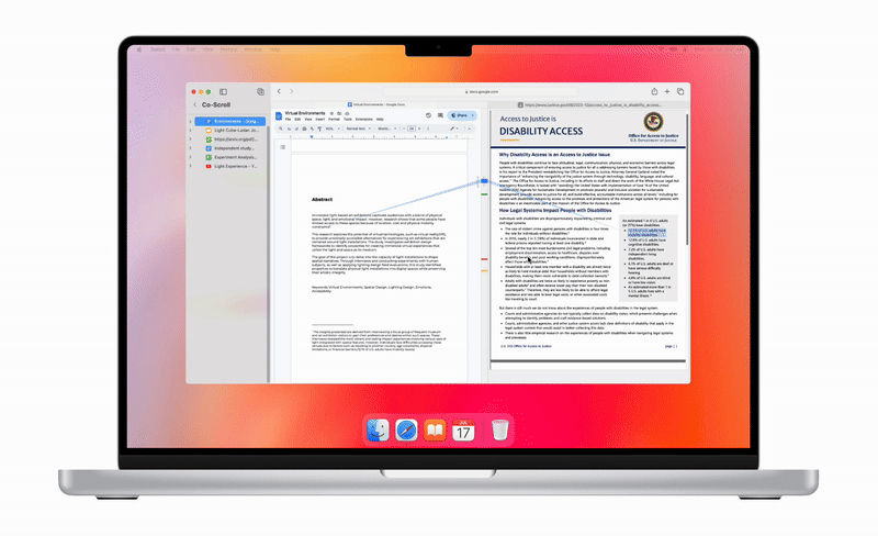
A visual interface for exploring connected documents. Trails offers a spatial way to browse, designed for researchers and creatives to connect and recall information. Rather than relying on folder hierarchies or linear browsing, this tool reveals relationships between documents, helping users think non-linearly and follow idea trails across time and space. Built as a Safari feature, it reimagines how we explore and link our knowledge.
Project
Interface design, spatial navigation, and document relationship mapping for creative research workflows.
My Role
Concept design, interaction modeling, and prototype development from sketch to working demo.
Timeline
6-weeks including user research, UI prototyping, and functional testing in Safari for native integration.
This project stemmed from conversations with designers, students, and writers who rely on web research.
The goal was to build a lightweight, browser-integrated tool that mimics how our minds map related ideas, not a bookmark manager, but a visual map of connections.
Visualize connections between open and saved documents
Support nonlinear thinking through trails and clusters
Reduce cognitive load and promote idea synthesis
Design Process
I followed a Design Thinking approach to guide this project, from empathy to testing, because it allowed me to stay user-centered while solving a complex, abstract problem.
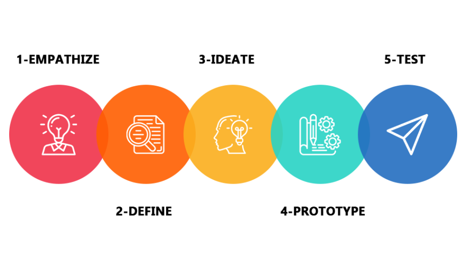
1. Empathize
I interviewed researchers and graduate students who frequently work across disciplines, Design, Computer Science, and Genetics. They often rely on web research and nonlinear workflows to connect ideas over time.
2. Define
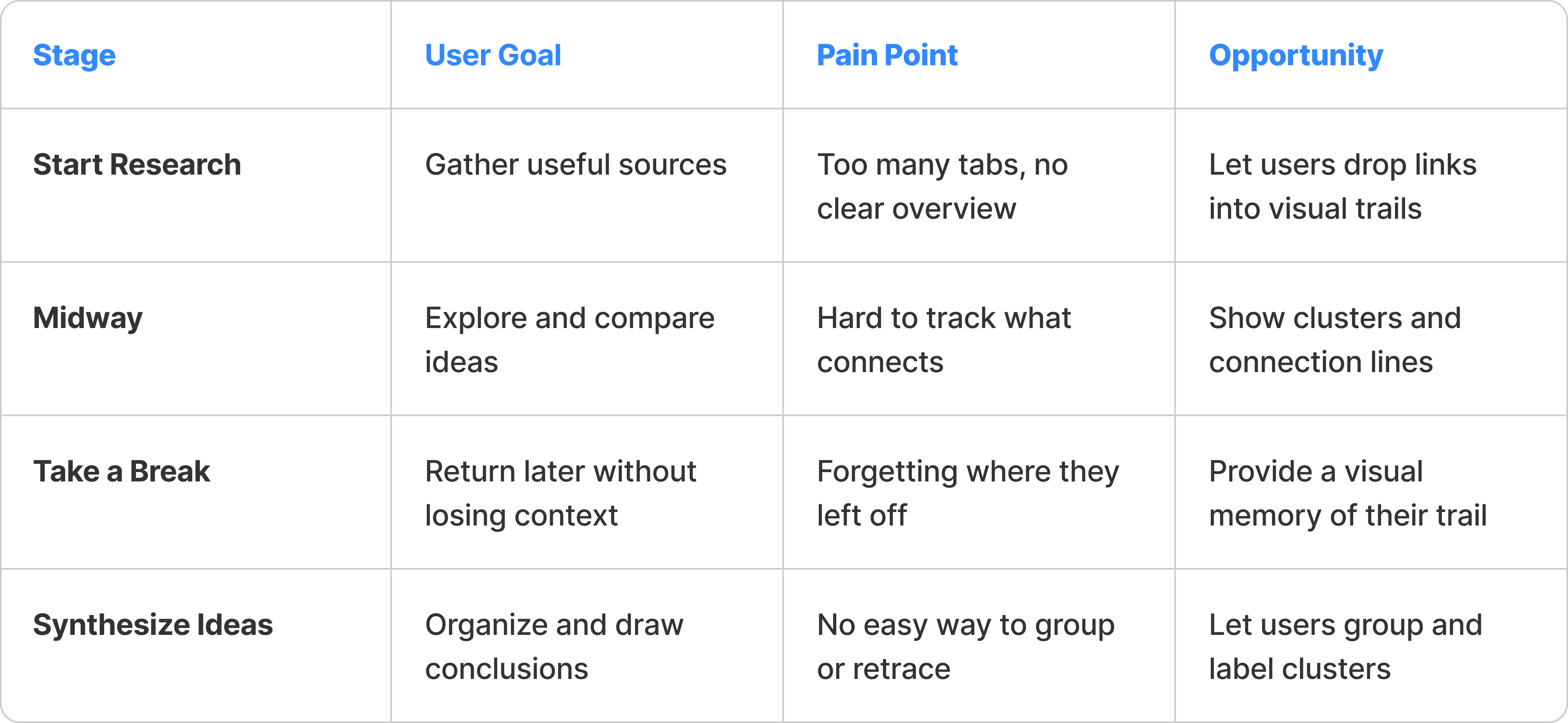
After talking to my focus group, I noticed the same problems came up again and again. They could collect a lot of information, but had trouble staying organized or remembering how everything connected.
Pain Points
🔺
Too Many Tabs
Hard to see the big picture when everything is spread out.
🔺
Hard to Retrace Paths
Users couldn’t easily go back and see how they got to an idea.
🔺
No Visual Grouping
No clear way to group related content or remember connections.
Solutions
3. Ideate
I explored different ways to help users see connections and follow their research flow. I sketched out ideas based on how people naturally group and revisit information.
Generating Ideas
For this project, I was rethinking how web browsing could support nonlinear thinking, moving from tabs and lists to trails, clusters, and visual context.
Mind Map Layout
Visual nodes show how documents relate to each other
Content Clustered Groups
Users can group and label related pages visually
Interactive Trails
Lines connect visited pages to form a visible path
Hover Snapshots
Help to recall content without switching tabs
User Journey Map
4. Prototype
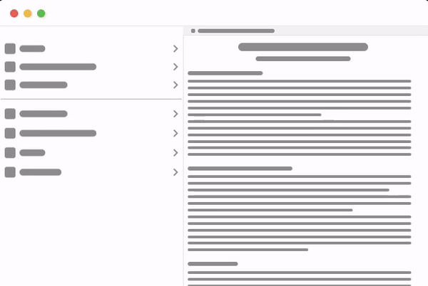
I built a prototype to test how well this column-based layout would work in practice. I built a clickable prototype to test if column-based navigation helped developers find symbols faster. It focused on filtering, jumping between types, and previewing definitions.
Low-Fidelity Prototype
I moved from concept sketches to working prototypes to test how well the ideas translated into real interactions. This phase helped validate layout, flow, and usability before final implementation.
The goal was to see if users could follow visual trails, group content meaningfully, and recall paths without relying on bookmarks or tabs.
Test if visual trails support memory and navigation
Validate grouping logic and document relationships
Measure ease of use within a live browser flow
Identify friction points before final polish
High-Fidelity Prototype
I built an interactive prototype that runs directly in Safari. It shows live trails, document connections, and interactive grouping features.
Prototype Demo
This demo version mimics real browsing behavior, allowing users to create and revisit visual paths without leaving the browser environment.
5. Test
I ran informal usability sessions with target users to understand how well the prototype supported real research workflows. Participants were asked to use the Safari-based demo to explore topics, connect related pages, and retrace their steps.
✅
Navigation Flow
Can users follow and revisit their research path easily?
✅
Group Creation
Do users understand how to cluster related documents?
✅
Recall Support
Does the interface help them remember where they’ve been?
✅
Overall Usability
Is the tool clear, helpful, and easy to use in real time?
“It felt like I was visually mapping my thoughts. I didn’t lose track of where I was or what connected to what.”
MFA Design researcher
Let’s Create with Intention
From concept to craft, I bring ideas to life. Reach out and let’s begin.
Get in Touch
Building a feature inside the browser taught me to think about interface design as part of a larger system. Instead of reinventing how people browse, I focused on adding value through subtle, supportive interactions.
Designing in Context
Learned to work with, not against, native browser behaviors.
Memory-Friendly Flow
Visualizing research as a path helped users stay oriented and focused.
System-Level Thinking
Prototyping in-browser showed me what was technically possible.
Visual Clarity Matters
Simple visual cues helps users feel in control of their process.
JL
A visual interface for exploring connected documents. Trails offers a spatial way to browse, designed for researchers and creatives to connect and recall information. Rather than relying on folder hierarchies or linear browsing, this tool reveals relationships between documents, helping users think non-linearly and follow idea trails across time and space. Built as a Safari feature, it reimagines how we explore and link our knowledge.
Project
Interface design, spatial navigation, and document relationship mapping for creative research workflows.
My Role
Concept design, interaction modeling, and prototype development from sketch to working demo.
Timeline
6-weeks including user research, UI prototyping, and functional testing in Safari for native integration.
This project stemmed from conversations with designers, students, and writers who rely on web research.
The goal was to build a lightweight, browser-integrated tool that mimics how our minds map related ideas, not a bookmark manager, but a visual map of connections.
Visualize connections between open and saved documents
Support nonlinear thinking through trails and clusters
Reduce cognitive load and promote idea synthesis
Design Process
I followed a Design Thinking approach to guide this project, from empathy to testing, because it allowed me to stay user-centered while solving a complex, abstract problem.
1. Empathize
I interviewed researchers and graduate students who frequently work across disciplines, Design, Computer Science, and Genetics. They often rely on web research and nonlinear workflows to connect ideas over time.
2. Define
After talking to my focus group, I noticed the same problems came up again and again. They could collect a lot of information, but had trouble staying organized or remembering how everything connected.
Pain Points
🔺
Too Many Tabs
Hard to see the big picture when everything is spread out.
🔺
Hard to Retrace Paths
Users couldn’t easily go back and see how they got to an idea.
🔺
No Visual Grouping
No clear way to group related content or remember connections.
Solutions
3. Ideate
I explored different ways to help users see connections and follow their research flow. I sketched out ideas based on how people naturally group and revisit information.
Generating Ideas
For this project, I was rethinking how web browsing could support nonlinear thinking, moving from tabs and lists to trails, clusters, and visual context.
Mind Map Layout
Visual nodes show how documents relate to each other
Content Clustered Groups
Users can group and label related pages visually
Interactive Trails
Lines connect visited pages to form a visible path
Hover Snapshots
Helping to recall content without switching tabs
User Journey Map
4. Prototype
I built a prototype to test how well this column-based layout would work in practice. I built a clickable prototype to test if column-based navigation helped developers find symbols faster. It focused on filtering, jumping between types, and previewing definitions.
Low-Fidelity Prototype
I moved from concept sketches to working prototypes to test how well the ideas translated into real interactions. This phase helped validate layout, flow, and usability before final implementation.
The goal was to see if users could follow visual trails, group content meaningfully, and recall paths without relying on bookmarks or tabs.
Test if visual trails support memory and navigation
Validate grouping logic and document relationships
Measure ease of use within a live browser flow
Identify friction points before final polish
High-Fidelity Prototype
I built an interactive prototype that runs directly in Safari. It shows live trails, document connections, and interactive grouping features.
Prototype Demo
This demo version mimics real browsing behavior, allowing users to create and revisit visual paths without leaving the browser environment.
5. Test
I ran informal usability sessions with target users to understand how well the prototype supported real research workflows. Participants were asked to use the Safari-based demo to explore topics, connect related pages, and retrace their steps.
✅
Navigation Flow
Can users follow and revisit their research path easily?
✅
Group Creation
Do users understand how to cluster related documents?
✅
Recall Support
Does the interface help them remember where they’ve been?
✅
Overall Usability
Is the tool clear, helpful, and easy to use in real time?
“It felt like I was visually mapping my thoughts. I didn’t lose track of where I was or what connected to what.”
MFA Design researcher
Building a feature inside the browser taught me to think about interface design as part of a larger system. Instead of reinventing how people browse, I focused on adding value through subtle, supportive interactions.
Designing in Context
Learned to work with, not against, native browser behaviors.
Memory-Friendly Flow
Visualizing research as a path helped users stay oriented and focused.
System-Level Thinking
Prototyping in-browser showed me what was technically possible.
Visual Clarity Matters
Simple visual cues helps users feel in control of their process.
Let’s Create with Intention
From concept to craft, I bring ideas to life. Reach out and let’s begin.
Get in Touch
JL
A visual interface for exploring connected documents. Trails offers a spatial way to browse, designed for researchers and creatives to connect and recall information. Rather than relying on folder hierarchies or linear browsing, this tool reveals relationships between documents, helping users think non-linearly and follow idea trails across time and space. Built as a Safari feature, it reimagines how we explore and link our knowledge.
Project
Interface design, spatial navigation, and document relationship mapping for creative research workflows.
My Role
Concept design, interaction modeling, and prototype development from sketch to working demo.
Timeline
6-weeks including user research, UI prototyping, and functional testing in Safari for native integration.
Researchers often juggle many open tabs and documents. Current browsing tools treat pages as isolated rather than interlinked, making idea synthesis harder.
📑 Tab Overload
Users lose context when juggling multiple documents.
➡️ Linear Browsing
Standard navigation ignores how ideas branch and relate.
🧠 No Spatial Recall
No visual memory of how concepts connect over time.
🔍 Hard to Revisit Paths
Hard to retrace steps or follow how ideas developed.
This project stemmed from conversations with designers, students, and writers who rely on web research.
The goal was to build a lightweight, browser-integrated tool that mimics how our minds map related ideas, not a bookmark manager, but a visual map of connections.
Visualize connections between open and saved documents
Support nonlinear thinking through trails and clusters
Reduce cognitive load and promote idea synthesis
Design Process
I followed a Design Thinking approach to guide this project, from empathy to testing, because it allowed me to stay user-centered while solving a complex, abstract problem.
1. Empathize
I interviewed researchers and graduate students who frequently work across disciplines, Design, Computer Science, and Genetics. They often rely on web research and nonlinear workflows to connect ideas over time.
Despite their fields, they shared a common frustration: the lack of a tool to “trace back their steps” or “group things that feel related.”
And I identified these key needs:
🔑
A visual way to revisit and organize research across multiple sessions
🔑
A lightweight system to reveal connections between documents over time
2. Define
After talking to my focus group, I noticed the same problems came up again and again. They could collect a lot of information, but had trouble staying organized or remembering how everything connected.
Pain Points
🔺
Too Many Tabs
Hard to see the big picture when everything is spread out.
🔺
Hard to Retrace Paths
Users couldn’t easily go back and see how they got to an idea.
🔺
No Visual Grouping
No clear way to group related content or remember connections.
Solutions
Based on the pain points, I designed features to help users stay organized, follow their thinking, and see how ideas connect.
💡 Trail View
Show research steps as a visual path to follow and revisit
💡 Linked Documents
Grouping related pages into clusters that stay connected
💡 Memory Cues
Use spatial layout and visual markers to support recall
💡 Browser Integration
Keep the experience simple by building directly into Safari
3. Ideate
I explored different ways to help users see connections and follow their research flow. I sketched out ideas based on how people naturally group and revisit information.
Generating Ideas
For this project, I was rethinking how web browsing could support nonlinear thinking, moving from tabs and lists to trails, clusters, and visual context.
Mind Map Layout
Visual nodes show how documents relate to each other
Content Clustered Groups
Users can group and label related pages visually
Interactive Trails
Lines connect visited pages to form a visible path
Hover Snapshots
Helping to recall content without switching tabs
User Journey Map
4. Prototype
I built a prototype to test how well this column-based layout would work in practice. I built a clickable prototype to test if column-based navigation helped developers find symbols faster. It focused on filtering, jumping between types, and previewing definitions.
Low-Fidelity Prototype
I moved from concept sketches to working prototypes to test how well the ideas translated into real interactions. This phase helped validate layout, flow, and usability before final implementation.
The goal was to see if users could follow visual trails, group content meaningfully, and recall paths without relying on bookmarks or tabs.
Test if visual trails support memory and navigation
Validate grouping logic and document relationships
Measure ease of use within a live browser flow
Identify friction points before final polish
High-Fidelity Prototype
I built an interactive prototype that runs directly in Safari. It shows live trails, document connections, and interactive grouping features.
Prototype Demo
This demo version mimics real browsing behavior, allowing users to create and revisit visual paths without leaving the browser environment.
5. Test
I ran informal usability sessions with target users to understand how well the prototype supported real research workflows. Participants were asked to use the Safari-based demo to explore topics, connect related pages, and retrace their steps.
✅
Navigation Flow
Can users follow and revisit their research path easily?
✅
Group Creation
Do users understand how to cluster related documents?
✅
Recall Support
Does the interface help them remember where they’ve been?
✅
Overall Usability
Is the tool clear, helpful, and easy to use in real time?
“It felt like I was visually mapping my thoughts. I didn’t lose track of where I was or what connected to what.”
MFA Design researcher
Building a feature inside the browser taught me to think about interface design as part of a larger system. Instead of reinventing how people browse, I focused on adding value through subtle, supportive interactions.
Designing in Context
Learned to work with, not against, native browser behaviors.
Memory-Friendly Flow
Visualizing research as a path helped users stay oriented and focused.
System-Level Thinking
Prototyping in-browser showed me what was technically possible.
Visual Clarity Matters
Simple visual cues helps users feel in control of their process.
Let’s Create with Intention
From concept to craft, I bring ideas to life. Reach out and let’s begin.
Get in Touch