JL
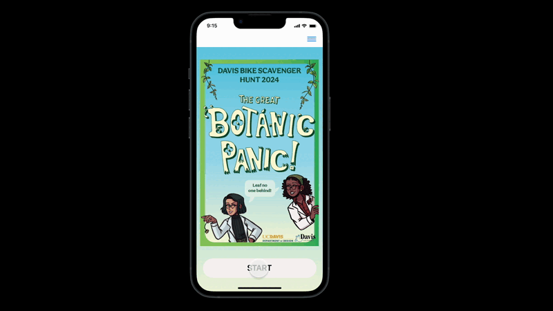
A mobile app for Davis’s annual bike scavenger hunt. Riders solve clues, discover hidden map stops, and plan their route turning city exploration into a fun, interactive challenge
Project
Interactive mobile experience for real-time city-based scavenger hunts.
My Role
UI/UX design, prototyping, and user testing from concept to interactive prototype.
Timeline
3-weeks sprint focused on user flows, visual design, and field-tested interactions.
This project began as a proposal to enhance the Davis annual bike scavenger hunt. The original event, developed in collaboration with UC Davis Design students, featured engaging visual identities and storytelling, relying on printed materials and external apps for navigation.
Inspired by the potential of the event, I designed a unified app experience that merges solving the clues, route planning, and real-time interaction into one platform.
Bring clues, maps, and progress tracking into one platform.
Keep the interface usable while biking.
Unlock locations dynamically as riders solve clues.
Design Process
I followed a Design Thinking approach to guide this project. The goal wasn’t just to digitize the scavenger hunt, but to elevate it: making it more intuitive, immersive, and accessible for riders of all kinds.
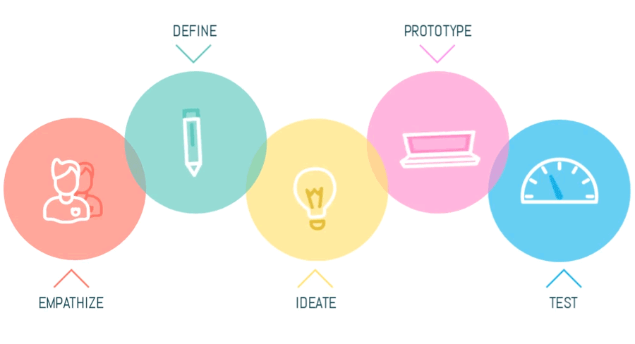
1. Empathize
I interviewed researchers and graduate students who frequently work across disciplines, Design, Computer Science, and Genetics. They often rely on web research and nonlinear workflows to connect ideas over time.
From these insights, I focused on two core design questions:

How can we reduce friction and keep the ride fun for all types of users?
How can we present clues and directions clearly, without pulling focus away from the ride?
2. Define
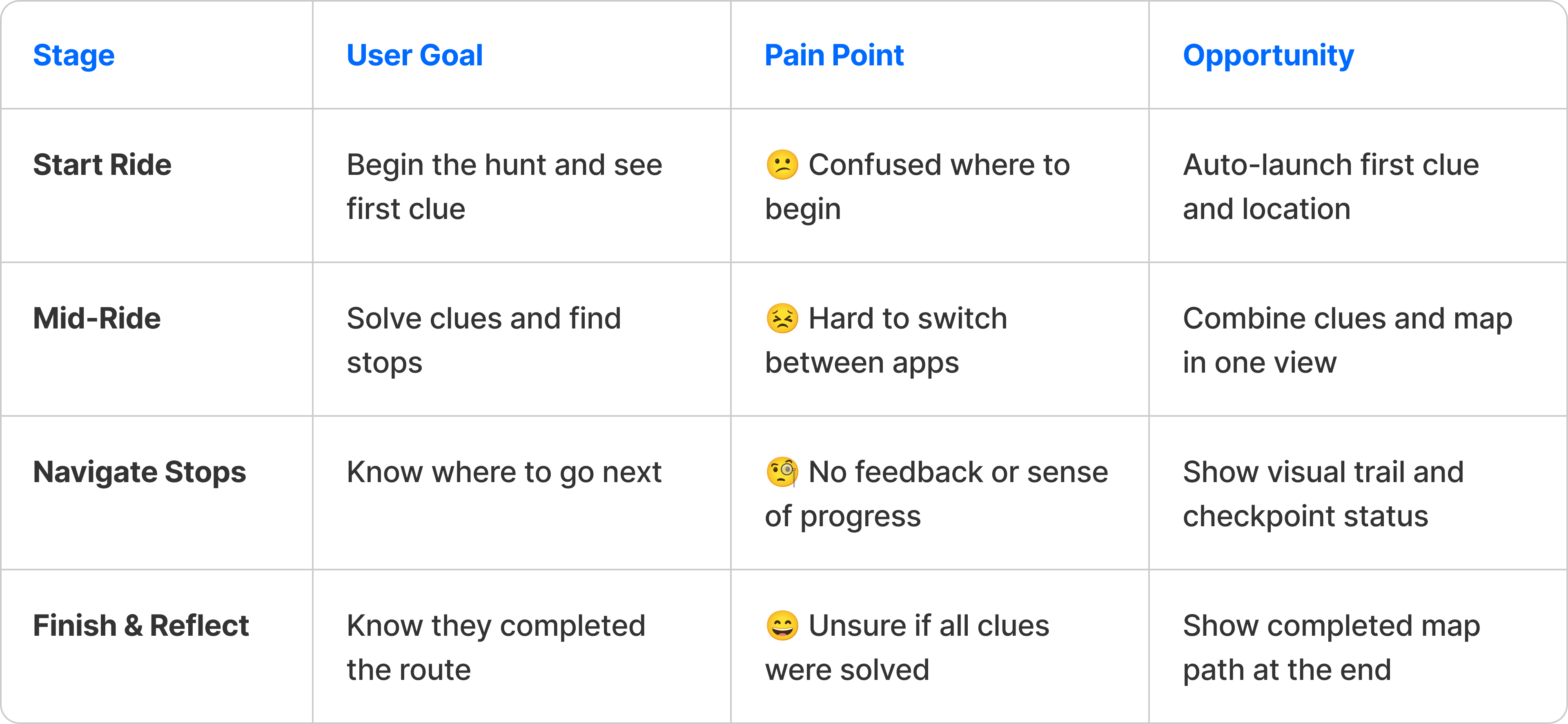
After reviewing feedback and mapping out the rider journey, I found recurring friction points that broke the flow of the scavenger hunt. Whether riding with kids, participating solo, or racing competitively, users struggled with the same issues, unclear directions, app-switching, and lack of real-time guidance.
Pain Points
🔺
Fragmented Navigation
Switching between maps and paper broke the flow.
🔺
Visual Feedback
Hart to track which clues were solved.
🔺
Distracting Interactions
Too many steps made the ride feel interrupted.
Solutions
3. Ideate
I explored different ways to simplify the scavenger hunt experience and keep riders in the flow. I sketched out ideas based on how people naturally move, solve clues, and stay oriented while biking.
Generating Ideas
Clue Unlock Flow
Reveal one clue at a time to keep focus and reduce overwhelm.
Progressive Map Pins
Only show new checkpoints once the previous clue is solved.
Stop Tracker Overlay
Let users view completed vs. remaining locations at a glance.
Tap-and-Go Interactions
Design for quick taps, no typing, no distractions.
User Journey Map
4. Prototype
Because this experience is built around biking, every interaction needed to be fast, clear, and touch-friendly.
Starting with low-fidelity wireframes helped me validate the core interactions, like clue progression and map integration, before refining the high-fidelity prototype. The goals for creating the prototype included:
Validate clue flow
Make sure clues are easy to follow, one at a time.
Simulate real-time map behavior
Ensure map pins appear only after solving clues.
Minimize distraction
Limit text and interaction to keep riders focused on the road.
Low-Fidelity Prototype
I began by sketching quick layouts to define how clues and map interactions would work together. This helped me explore pacing, screen transitions, and how riders would move through the hunt step by step.
Prototype Demo
I translated early concepts into interactive form to evaluate layout, flow, and clarity during motion-based use. Because this experience is built around biking, every interaction needed to be fast, clear, and touch-friendly.
Starting with low-fidelity wireframes helped me validate the core interactions—like clue progression and map integration—before refining the high-fidelity prototype. The goals for creating the prototype included:
Prototype Demo
I created a high-fidelity prototype simulating the scavenger hunt flow, from viewing the first clue to unlocking stops and tracking progress. The interface features bold text, large tap targets, and animated transitions to enhance readability while riding.
Designing in Context
Learned to work with, not against, native browser behaviors.
Memory-Friendly Flow
Visualizing research as a path helped users stay oriented and focused.
System-Level Thinking
Prototyping in-browser showed me what was technically possible.
Visual Clarity Matters
Simple visual cues helps users feel in control of their process.
5. Test
To evaluate the usability and clarity of the app, I conducted informal event with riders familiar with the Davis scavenger hunt. I observed how different personas interacted with the prototype and looked for moments of friction, hesitation, or delight.
“This made the hunt feel more real-time, like the city was responding to me.”
Local rider and event veteran ;)
🧪
Did riders understand how to begin the hunt quickly?
🧪
Could participants track progress without confusion?
🧪
Was the interface easy to use while in motion?
Building a feature inside the browser taught me to think about interface design as part of a larger system. Instead of reinventing how people browse, I focused on adding value through subtle, supportive interactions.
Designing for Movement
Designing for biking required large tap targets, minimal text, and quick interactions that work in motion.
Blending narrative and navigation
Integrating clues with live map feedback helped keep participants engaged throughout the hunt.
Building on Existing Identity
Using the scavenger hunt’s existing graphics created instant familiarity and enhanced trust for participants.
Testing in Context Matters
Participants interaction while moving helped uncover design tweaks and usability improvement.
Credits
All visual identities and graphic assets featured in the prototype were created by students of DES187: Narrative Environments course at UC Davis, Spring 2024 under the instruction of Professor Tim McNeil.
Let’s Create with Intention
From concept to craft, I bring ideas to life. Reach out and let’s begin.
Get in Touch
JL
A mobile app for Davis’s annual bike scavenger hunt. Riders solve clues, discover hidden map stops, and plan their route turning city exploration into a fun, interactive challenge
Project
Interactive mobile experience for real-time city-based scavenger hunts.
My Role
UI/UX design, prototyping, and user testing from concept to interactive prototype.
Timeline
3-weeks sprint focused on user flows, visual design, and field-tested interactions.
This project began as a proposal to enhance the Davis annual bike scavenger hunt. The original event, developed in collaboration with UC Davis Design students, featured engaging visual identities and storytelling, relying on printed materials and external apps for navigation.
Inspired by the potential of the event, I designed a unified app experience that merges solving the clues, route planning, and real-time interaction into one platform.
Bring clues, maps, and progress tracking into one platform.
Keep the interface usable while biking.
Unlock locations dynamically as riders solve clues.
Design Process
I followed a Design Thinking approach to guide this project. The goal wasn’t just to digitize the scavenger hunt, but to elevate it: making it more intuitive, immersive, and accessible for riders of all kinds.
1. Empathize
I interviewed researchers and graduate students who frequently work across disciplines, Design, Computer Science, and Genetics. They often rely on web research and nonlinear workflows to connect ideas over time.
From these insights, I focused on two core design questions:
How can we reduce friction and keep the ride fun for all types of users?
How can we present clues and directions clearly, without pulling focus away from the ride?
2. Define
After reviewing feedback and mapping out the rider journey, I found recurring friction points that broke the flow of the scavenger hunt. Whether riding with kids, participating solo, or racing competitively, users struggled with the same issues, unclear directions, app-switching, and lack of real-time guidance.
Pain Points
🔺
Fragmented Navigation
Switching between maps and paper broke the flow.
🔺
Visual Feedback
Hart to track which clues were solved.
🔺
Distracting Interactions
Too many steps made the ride feel interrupted.
Solutions
3. Ideate
I explored different ways to simplify the scavenger hunt experience and keep riders in the flow. I sketched out ideas based on how people naturally move, solve clues, and stay oriented while biking.
Generating Ideas
Clue Unlock Flow
Reveal one clue at a time to keep focus and reduce overwhelm.
Progressive Map Pins
Only show new checkpoints once the previous clue is solved.
Stop Tracker Overlay
Let users view completed vs. remaining locations at a glance.
Tap-and-Go Interactions
Design for quick taps, no typing, no distractions.
User Journey Map
4. Prototype
Because this experience is built around biking, every interaction needed to be fast, clear, and touch-friendly.
Starting with low-fidelity wireframes helped me validate the core interactions, like clue progression and map integration, before refining the high-fidelity prototype. The goals for creating the prototype included:
Validate clue flow
Make sure clues are easy to follow, one at a time.
Simulate real-time map behavior
Ensure map pins appear only after solving clues.
Minimize distraction
Limit text and interaction to keep riders focused on the road.
Low-Fidelity Prototype
I began by sketching quick layouts to define how clues and map interactions would work together. This helped me explore pacing, screen transitions, and how riders would move through the hunt step by step.
Prototype Demo
I translated early concepts into interactive form to evaluate layout, flow, and clarity during motion-based use. Because this experience is built around biking, every interaction needed to be fast, clear, and touch-friendly.
Starting with low-fidelity wireframes helped me validate the core interactions—like clue progression and map integration—before refining the high-fidelity prototype. The goals for creating the prototype included:
Prototype Demo
I created a high-fidelity prototype simulating the scavenger hunt flow, from viewing the first clue to unlocking stops and tracking progress. The interface features bold text, large tap targets, and animated transitions to enhance readability while riding.
Designing in Context
Learned to work with, not against, native browser behaviors.
Memory-Friendly Flow
Visualizing research as a path helped users stay oriented and focused.
System-Level Thinking
Prototyping in-browser showed me what was technically possible.
Visual Clarity Matters
Simple visual cues helps users feel in control of their process.
5. Test
To evaluate the usability and clarity of the app, I conducted informal event with riders familiar with the Davis scavenger hunt. I observed how different personas interacted with the prototype and looked for moments of friction, hesitation, or delight.
“This made the hunt feel more real-time, like the city was responding to me.”
Local rider and event veteran ;)
🧪
Did riders understand how to begin the hunt quickly?
🧪
Could participants track progress without confusion?
🧪
Was the interface easy to use while in motion?
Building a feature inside the browser taught me to think about interface design as part of a larger system. Instead of reinventing how people browse, I focused on adding value through subtle, supportive interactions.
Designing for Movement
Designing for biking required large tap targets, minimal text, and quick interactions that work in motion.
Blending narrative and navigation
Integrating clues with live map feedback helped keep participants engaged throughout the hunt.
Building on Existing Identity
Using the scavenger hunt’s existing graphics created instant familiarity and enhanced trust for participants.
Testing in Context Matters
Participants interaction while moving helped uncover design tweaks and usability improvement.
Credits
All visual identities and graphic assets featured in the prototype were created by students of DES187: Narrative Environments course at UC Davis, Spring 2024 under the instruction of Professor Tim McNeil.
Let’s Create with Intention
From concept to craft, I bring ideas to life. Reach out and let’s begin.
Get in Touch
JL
A mobile app for Davis’s annual bike scavenger hunt. Riders solve clues, discover hidden map stops, and plan their route turning city exploration into a fun, interactive challenge
Project
Interactive mobile experience for real-time city-based scavenger hunts.
My Role
UI/UX design, prototyping, and user testing from concept to interactive prototype.
Timeline
3-weeks sprint focused on user flows, visual design, and field-tested interactions.
Each year, Davis hosts a playful bike scavenger hunt. Most riders used printed clues or ad-hoc tools like Google Maps, making the experience hard to follow.
📄 Fragmented Tools
Participants switch between printed clues and digital maps, disrupting the flow of the ride.
📍 No Real-Time Feedback
There’s no way to track solved clues or visualize progress across the route.
📱 Lack of Integration
The experience lacks a unified interface that brings navigation, storytelling, and gameplay together.
This project began as a proposal to enhance the Davis annual bike scavenger hunt. The original event, developed in collaboration with UC Davis Design students, featured engaging visual identities and storytelling, relying on printed materials and external apps for navigation.
Inspired by the potential of the event, I designed a unified app experience that merges solving the clues, route planning, and real-time interaction into one platform.
Bring clues, maps, and progress tracking into one platform.
Keep the interface usable while biking.
Unlock locations dynamically as riders solve clues.
Design Process
I followed a Design Thinking approach to guide this project. The goal wasn’t just to digitize the scavenger hunt, but to elevate it: making it more intuitive, immersive, and accessible for riders of all kinds.
1. Empathize
I interviewed researchers and graduate students who frequently work across disciplines, Design, Computer Science, and Genetics. They often rely on web research and nonlinear workflows to connect ideas over time.
From these insights, I focused on two core design questions:
How can we reduce friction and keep the ride fun for all types of users?
How can we present clues and directions clearly, without pulling focus away from the ride?
2. Define
After reviewing feedback and mapping out the rider journey, I found recurring friction points that broke the flow of the scavenger hunt. Whether riding with kids, participating solo, or racing competitively, users struggled with the same issues, unclear directions, app-switching, and lack of real-time guidance.
Pain Points
🔺
Fragmented Navigation
Switching between maps and paper broke the flow.
🔺
Visual Feedback
Hart to track which clues were solved.
🔺
Distracting Interactions
Too many steps made the ride feel interrupted.
Solutions
Based on these challenges, I designed features that deliver clarity without distraction, so participants can stay immersed in the ride while still feeling guided and engaged.
💡 Clue Reveal Flow
Present one clue at a time to keep users focused and reduce visual clutter.
💡 Progress Tracker
Highlight solved vs. unsolved stops with visual markers and simple animations.
💡 Minimal Taps
Limit interaction to quick taps and reveals, no typing or scrolling required.
3. Ideate
I explored different ways to simplify the scavenger hunt experience and keep riders in the flow. I sketched out ideas based on how people naturally move, solve clues, and stay oriented while biking.
Generating Ideas
Clue Unlock Flow
Reveal one clue at a time to keep focus and reduce overwhelm.
Progressive Map Pins
Only show new checkpoints once the previous clue is solved.
Stop Tracker Overlay
Let users view completed vs. remaining locations at a glance.
Tap-and-Go Interactions
Design for quick taps, no typing, no distractions mid-ride.
User Journey Map
4. Prototype
Because this experience is built around biking, every interaction needed to be fast, clear, and touch-friendly.
Starting with low-fidelity wireframes helped me validate the core interactions, like clue progression and map integration, before refining the high-fidelity prototype. The goals for creating the prototype included:
Validate clue flow
Make sure clues are easy to follow, one at a time.
Simulate real-time map behavior
Ensure map pins appear only after solving clues.
Minimize distraction
Limit text and interaction to keep riders focused on the road.
Low-Fidelity Prototype
I began by sketching quick layouts to define how clues and map interactions would work together. This helped me explore pacing, screen transitions, and how riders would move through the hunt step by step.
Prototype Demo
I translated early concepts into interactive form to evaluate layout, flow, and clarity during motion-based use. Because this experience is built around biking, every interaction needed to be fast, clear, and touch-friendly.
Starting with low-fidelity wireframes helped me validate the core interactions—like clue progression and map integration—before refining the high-fidelity prototype. The goals for creating the prototype included:
Prototype Demo
I created a high-fidelity prototype simulating the scavenger hunt flow, from viewing the first clue to unlocking stops and tracking progress. The interface features bold text, large tap targets, and animated transitions to enhance readability while riding.
Designing in Context
Learned to work with, not against, native browser behaviors.
Memory-Friendly Flow
Visualizing research as a path helped users stay oriented and focused.
System-Level Thinking
Prototyping in-browser showed me what was technically possible.
Visual Clarity Matters
Simple visual cues helps users feel in control of their process.
5. Test
To evaluate the usability and clarity of the app, I conducted informal event with riders familiar with the Davis scavenger hunt. I observed how different personas interacted with the prototype and looked for moments of friction, hesitation, or delight.
“This made the hunt feel more real-time, like the city was responding to me.”
Local rider and event veteran ;)
🧪
Did riders understand how to begin the hunt quickly?
🧪
Could participants track progress without confusion?
🧪
Was the interface easy to use while in motion?
Building a feature inside the browser taught me to think about interface design as part of a larger system. Instead of reinventing how people browse, I focused on adding value through subtle, supportive interactions.
Designing for Movement
Designing for biking required large tap targets, minimal text, and quick interactions that work in motion.
Blending narrative and navigation
Integrating clues with live map feedback helped keep participants engaged throughout the hunt.
Building on Existing Identity
Using the scavenger hunt’s existing graphics created instant familiarity and enhanced trust for participants.
Testing in Context Matters
Participants interaction while moving helped uncover design tweaks and usability improvement.
Credits
All visual identities and graphic assets featured in the prototype were created by students of DES187: Narrative Environments course at UC Davis, Spring 2024 under the instruction of Professor Tim McNeil.
Let’s Create with Intention
From concept to craft, I bring ideas to life. Reach out and let’s begin.
Get in Touch